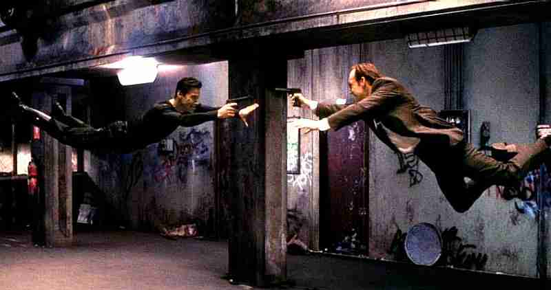
Like it or not, the life in an urban centre is defined by its subway stations. Commuters pass through these spaces everyday, but are greeted by utilitarian enclosures designed to serve the train cars more than the passengers.
A long abandoned website, (http://metroart-subways.blogspot.com/) collects a handful of the world's beautiful subway stations. From the baroque allusions in Russia, to the organic-structuralist elegance of Calatrava's. Subway stations have found been built with identities. And scrolling through these, one would wonder... What happened to our subways today? Still many of them are built with little identity that one would be proud to be associated with everyday while commuting to work.
Like in many other cities, Sydney's train stations are "photocopies" of a prototype that worked very well in its time. With the duplication of these stations so vastly over the network, comes a generalisation of what a train station should look like. The pitched roof, the logo, the colour. The same goes for Singapore and Kuala Lumpur's commuter networks. Generic cut-and-paste architectural "solutions".
There must be a move for train stations to be able to understand and interact with its context or vice versa. The Karlsplatz station was built to the avant garde Art Nouveau style. It is today, a hotspot to the avant garde artistic youth. As such, it has gained an identity.

Celebrated urbanist Rem Koolhaas completed the Souterrain Tram Tunnel in Hague, where with 2 trams stations and a 500 bay parking lot, he brought a new definition to underground station typology.
The Dutch government spent 4 years building the project, contemplating if it was worth all the trouble of by submerging density and transport systems underground and freeing up the streets above.

Koolhaas brought the adjacent building facades below grade, effectively allowing the underground urbanism to relate to a broader idea of "streetscape". And with timber as a flooring material on the platforms, managed to soften the effect of transport infrastructure, away from those harsh rivetted columns or concrete platforms.
Each train station should be designed with careful thought to its surroundings in order to maximise even the most pragmatic needs - commercial worth and effective distribution of movements. 
(Photo of Matrix scene from Gapyx.com. The original full-sized color version can be viewed by clicking the photo.)
(Photo of Hornsby Station from Wikipedia. The original full-sized color version can be viewed by clicking the photo.)
(Photo of Souterrain from Architecture Page. The original full-sized color version can be viewed by clicking the photo.)

No comments:
Post a Comment