I love the internet.
Showing posts with label maps. Show all posts
4.21.2012
10.15.2011
A Modest Proposal...
A few years ago I made a series of hackmaps, using Google Earth to cobble together a few visualizations of alternate urban realities. I'd always planned to post some of the better ones to Where, and never got around to it. Recent events, however, made me think that there was one in particular that was worth sharing.
The image above was created in the fall of 2008, right as the financial meltdown was getting white-hot. The idea that the wizards of Wall Street should share their posh financial district with a Rio-style favela seemed fitting, given the number of people who were suddenly finding themselves homeless. Luckily, there was a huge hole in the ground right next door.
The site may have been overly ambitious, but it's good to see that some people have been feeling the same way.
Labels:
economics,
favela,
google earth,
housing,
maps,
new york,
rio de janeiro
5.25.2011
Cartographic Diversion: An Illustration of Density
With 166 people per square mile, Honduras is in the middle of the pack as far as national population densities are concerned. But what would it look like if you packed every single Honduran into one city? As it turns out, it might look a lot like New York: both contain approximately 8.2 million people. Below are images of the administrative borders of the five largest cities in the US mapped onto the nations that most closely mirror their populations, all at the same scale. No big point to be made...just an interesting distraction for a Wednesday afternoon. Enjoy... 
New York City: 8,175,133 -/- Honduras: 8,249,574
Los Angeles: 3,833,995 -/- Congo: 3,686,000
Philadelphia: 1,526,006 -/- Gabon: 1,475,000
Chicago: 2,695,598 -/- Oman: 2,845,000
Houston: 2,099,451 -/- Lesotho: 2,067,000
Labels:
africa,
chicago,
congo,
demographics,
density,
gabon,
honduras,
houston,
lesotho,
los angeles,
maps,
new york,
oman,
philadelphia
1.22.2009
Wherever you go, there you are.
It struck me the other day, while reading one of Springwise's increasingly frequent posts on the mass customization of travel, that the types of travel apps and sites being developed right now to personalize the urban travel experience could have a profound impact not just on how we visit cities, but on how cities themselves function, as well.Urban travel has long been a two-sided coin, with time in a new city being divided (in different ratios, depending on the tourist) between the standard landmarks like the Empire State Building or the Forbidden City, and the day-to-day urban world that exists on the edges of guidebooks; think of Brooklyn back in the 1990s, or Beijing's fast-evaporating hutongs today -- places to which people are drawn to observe a quotidian rhythm different from their own: to experience the spectacle of the extraordinary-ordinary.
The Postcard City and the Real City are invariably pitted against each other in a battle for the urban tourist's limited time. But as cities grow bigger and bolder on our increasingly urban planet, it seems fair to assume that greater and greater numbers of tourists will make their way down the streets of cities that they do not call home; as such, the traditional landmarks and attractions will become more and more crowded, making the prospect of tooling around lesser-seen corners of the metropolis an increasingly attractive option for visitors.
The aforementioned trend blog has spotted some real doozies lately: a site that allows you to navigate cities by mood (Could Yelp-like testimonials about certain blocks, streets, parks, or even whole neighborhoods define or even change the mood of a given place?); another that uses personal data to create personalized guidebooks (Would the diversity of interests force travel publishers to re-think the meaning of the term "attraction?" I.E. cyclists' internationally competitive quests to speed up the steepest slopes could reboot the way a whole subculture navigates hilly cities like San Francisco, Pittsburgh, Guilin, and Lisbon); and another that helps you track down a hot scene at the last minute with crowdsourced GPS data (Anybody up for an impromptu, flashmob-style block party?)
By making wandering off the beaten path more enticing, the customization of the urban tourism experience has the potential to distribute visitors more evenly around the city than old-school printed-paper guides, with their restricted map insets and hyper-selective restaurant listings. But does this dispersal of small-time explorers legitimize or cheapen the Real City? It seems to echo ongoing arguments about gentrification; after all, while the presence of individual tourists at specific sites is fleeting, their combined influence can be very powerful over time. And, while the carving of initials into a famous landmark is a time-honored tradition (as old as the very idea of landmarks), tourists will soon be able to carve their very presence into a city in the unpredictable paths that they cut through it, shifting not only the way that other visitors, but the very citizens of the city in question, navigate and experience a place.
(Image from Flickr user LondonSLR. The original full-sized versions can be viewed by clicking the photo.)
1.02.2009
The Topography of Community
Found during a routine aimless wandering through Wikipedia: a map of the boundaries of every commune (municipality) in metropolitan France. So interesting; I couldn't help but share.
Labels:
community,
france,
landscape,
maps,
topography
11.11.2008
CartogrAmerica
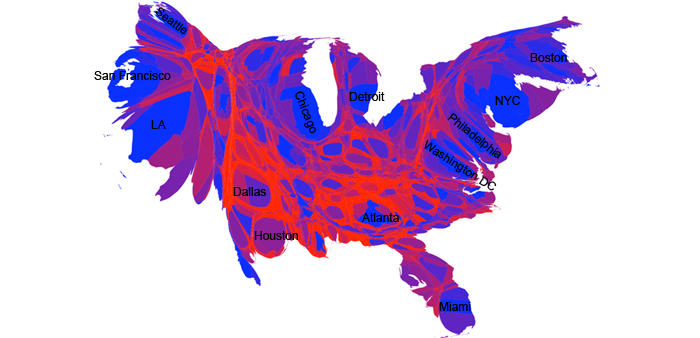
Besides its outcome, the 2008 election was remarkable for another reason: the incredible range of maps produced to explain how people voted. My favorite map, by far, was actually a cartogram produced by Mark Newman.

Cartograms, "transformations of a map where the original polygons expand or contract their area based on an attribute value they have," can tell remarkable stories. In Newman's cartogram, above, counties are scaled based on the size of their populations and colored based on the proportion of democratic and republican votes. Besides being able to see how many people actually live in urban areas, this cartogram shows how people tend to vote there too. More analysis and a comparison to the 2004 election can be found on Newman's site.
(Cartogram by Mark Newman. Version with labels available from flickr.

Cartograms, "transformations of a map where the original polygons expand or contract their area based on an attribute value they have," can tell remarkable stories. In Newman's cartogram, above, counties are scaled based on the size of their populations and colored based on the proportion of democratic and republican votes. Besides being able to see how many people actually live in urban areas, this cartogram shows how people tend to vote there too. More analysis and a comparison to the 2004 election can be found on Newman's site.
(Cartogram by Mark Newman. Version with labels available from flickr.
Labels:
barack obama,
maps
7.22.2008
Rankability
WalkScore has taken their delicious color-coded walkability maps, previously covered on Where, national. The results are...well, a bit disappointing. Perhaps I'm the only one, but I'm getting a bit tired of seeing rankings that use central city populations to determine the sample cities when metropolitan populations are far more important in determining the stature of an urban area. It makes little sense that Jacksonville, Tucson, and Oklahoma City make the cut for such rankings while St. Louis, Cincinnati, and Pittsburgh -- the central cities of much larger, more important metropolitan areas -- are left out because they've lost population to suburbanization. This methodology has been a minor annoyance to me for some time, but the oversight seems particularly egregious in the case of WalkScore's ranking since it punishes densely-built urban centers for falling victim to exactly what the site is supposedly working against, and rewards cities that inflate their population counts through annexation and suburban deveopment patterns. The end result is a bit embarassing, with the overall city scores dropping under 70/100 points before you even get past the top ten on the list. Average everything out and the US gets a big fat F for walkability in its cities.
While there's a long way to go for Americans to become a more pedestrian-minded people, the idea that only a handful of our major cities are walkable is a bit absurd, and seems more like a misrepresentation than useful information. While it certainly shows the damage that suburbanization has done to our cultural understanding of urbanity, it says little about the actual state of walkability in America.
And that's too bad, because the maps look great, and the idea behind the rankings is a good one. If real estate is about location, the mantra for academic study should be "Execution, execution, execution."
7.10.2008
Digital Density

Dense concentrations of people = dense concentrations of information. Will the NIMBYs of the digital city complain about websites that ruin the character of neighborhood infoclouds? Or perhaps block new sites from launching because they displace smaller, scrappier sites with more interesting content? Will the artistic streetpunks and art insurgents of tomorrow be carefully and sneakily grafting their tag onto Flickr images?
Is the future of urban activism electronic?
Labels:
art,
chicago,
creativity,
culture,
density,
internet,
magical spaces,
maps,
nimbyism,
psychogeography,
technology,
user-generated media
7.07.2008
6.26.2008
The New WalkScore
The popular Gmaps mashup, which made a big splash in urbanism circles last year when it debuted, has a fantastic new color-coded map of Seattle up on their site. Hopefully this is a sign of things to come. I'll be waiting anxiously for the Chicago map.
Labels:
internet,
maps,
seattle,
urbanism,
walkability
4.27.2008
Urbanffffinds 027
Apologies for the lack of Urbanffffinds last week. This week, please accept this double-shot of urban imagery goodness as a peace offering. And some more happy news: part-time employment has been secured, and regular posting will resume at Where, starting with almost three weeks of great arch&urb stuff in a hearty linkdump, tomorrow morning.


Labels:
architecture,
buenos aires,
cars/traffic,
chicago,
dubai,
history,
italy,
light,
maps,
new york,
newcastle,
photography,
seoul,
small town,
toronto,
transit,
trees,
urbanffffinds,
visionary
4.04.2008
WEEKEND READING: March 29-April 4, 2008
First things first: MONU has put out a Call for Submissions for their upcoming issue on "Exotic Urbanism." Sounds freaking brillaint. Now, on to this week's cream o' the crop.ITEM ONE: New-ish blog Boredom Is Always Counter-Revolutionary with a cutting rant about advertisements, architecture, and envisioning the city of the future.
ITEM TWO: Lee Bey has his own cutting rant this week, this one zeroing in on race, crime, and public housing in Chicago. Spot-on.
ITEM THREE: Switching gears a bit, MNP's post on suburb-eating robots will blow your mind and tickle your funny bone. (Photo credit)
ITEM FOUR: Interchange blogger Scott Page on DIY Urbanism and the upcoming Wicker Park Bucktown workshops in Chicago.
ITEM FIVE: CS Monitor examines Hugo Chavez's plan to build a Venezuelan Brasilia of sorts. Welcome to Caribia, the 21st Century Socialist City.
ITEM SIX: Some eye candy from The Map Room -- a collection of late 19th and early 20th century maps of Latin American cities.
ITEM SEVEN: More humor to cap things off this week. The Onion features an hilarious exposé on the aristocrization of gentrified neighborhoods in American cities (via Super Colossal).
Adios, compadres. See you next week!
3.31.2008
W(e are )here
The following post contains the introduction that this blogger wrote for the W(e are )here show, which opens today at the Intermedia Arts Gallery in Minneapolis. The show is being curated by the founders of Solutions Twin Cities; if you're going to be around the Cities at all between now and May 9th, 2008, do stop by and take a look. For more information, see the link at the bottom of the post.During the Age of Discovery, great explorers crisscrossed the planet in search of uncharted territory. They left a visual legacy in the maps that recorded their journeys, and with each new discovery, mankind's knowledge of Earth grew. One can only imagine how thrilling it must have been to live in a world that was seemingly growing larger by the day. The very concept of "where" -- humanity's understanding of our relationship to the world around us -- was expanding.
Today, the internet revolution has democratized exploration in ways that Columbus and Magellan could never have imagined: everyone has become an explorer. New cartographers are adding their personal explorations to existing maps and creating new records of their own experiences. If that which is observed is inherently altered, it follows that a person's experience of a place directly changes the place itself; places are what people believe them to be. That means that today's maps are about much more than hills, valleys, rivers, and roads. Maps have become tools for examining the emotional, sociological, and philosophical aspects of the human experience.
The concept of "where" is changing once again, expanding to include increasingly minute and varied facets of our world. The ever-ephemeral sense of place is created by human interaction with the physical world. Maps have always charted changing systems, but in the internet age the more intense focus on the hyperlocal has sped up the rate at which cartographers work. Slower-moving features of the planet -- shifting continents, growing cities, and eroding shorelines -- have already been adequately mapped; places are now being recorded as they exist for short periods of time. New maps record what could be termed the "hypercurrent."
Within this gallery, you will find a sampling of how cartography is being redefined by this change in scale. Whether recording a tiny patch of previously unremarkable forest floor down to the tiniest twig and blade of grass, reorganizing the contents of the Bible to visualize cross-references and social relationships, or taking a fresh look at urban growth by examining the construction date of houses currently on the market, today's cartographers are rethinking how the world around us is recorded and represented to assert the fact that we are here. This new breed of explorer is taking the impersonal maps and graphs of yesterday and making them deeply personal.
Welcome to the New Age of Discovery.
Where is expanding. W(e are )here.
Links:
W(e are )here (Intermedia Arts)
Solutions Twin Cities
Blog Like You Give a Damn
Labels:
art,
creativity,
exploration,
innovation,
internet,
maps,
minneapolis,
physical environment,
place,
technology
3.17.2008
Exploring the City of Tomorrow
![]() |
| A hypothetical Aura Map of Istanbul's Golden Horn. |
Google Transit wants your city to get on their bus. At the American Public Transportation Association's recent TransITech conference the web giant's mass trans-tracking maps app (say that five times fast) challenged every transit agency in attendance to upload their schedules and information to the site by Earth Day of 2008. If Google's effort at TransITech is successful, live, up-to-date GPS-powered transit tracking for every major city in the country (and beyond) could be a reality much sooner than one might imagine.
It's a bit freaky at first; there's a whiff of Big Brother, and a dash of 1984. But once the knee-jerk paranoia passes, the benefits begin to sink in. With live-feed transit information, Google Maps and Google Earth could eliminate the need for standing on a windy or snowy street corner for twenty minutes, waiting for a late bus. Outside it could be pouring rain, but you'd know exactly when to leave the house to catch your train. Even making connections could be more easily choreographed. Suddenly, one of mass transit's biggest drawbacks -- unreliability -- is eliminated. Overcrowding becomes less of a problem, and the whole system runs more smoothly. Everyone wins.
Online mapping technology has come a long way since the basic click-navigation maps of MapQuest hit the web back in the 1990s. Nowadays you can easily access street-level views, satellite images, and highly-detailed maps of buildings and amenities of dozens of cities. Certainly, this makes the prospect of taking an exploratory walk through a new part of town less daunting; you can preview your route, get a feel for landmarks, even decide where you want to stop for lunch. But there's still a dimension missing. Online maps are still very much stuck in the 3D-level, at least as far as the masses are concerned. We're still figuring out how to map the most important factor in cities: people. Not individuals (again with the creepy 1984ishness), but crowds, traffic patterns, and even emotions.
Think back, once again, to the SimCity game franchise. In later versions of the game, players could open up maps that charted everything from traffic to crime to the general happiness (aura) of the entire city. Live. Can you imagine the potential of people-mapping technology as a tool for planners and policy-makers?
A scenario: it's 8:00pm on a Friday in the year 2015, and you're looking for something to do. You grab your wi-fone and fire up the GoogleCity live maps app. There are three parties within a ten minute walk of your house being advertised on GoogleSocial (a convenient MeetUp/Bebo-powered mashup), a wifi-gallery showing one of your favorite artists from deviantArt four subway stops to the south, a restaurant opening on the corner where that hookah bar just closed last spring, and a band whose iSpace page you just subscribed to because you heard one of their songs on Pandora's new Loc:Audio channel. There's no excuse to be bored. And oh, look -- if you leave now, you can catch the next bus, but it'll be at least five minutes for a train. Perhaps tonight will be a concert night? The e-stars have aligned...
You're happy. You're entertained. You click a button on the screen that tells Google that someone on your block is in high spirits. The block's aura jumps up one point. At City Hall a few weeks later, the general happiness trend of your neighborhood is noticed to be on the rise. Civic officials study the area to learn why this spike in aura has been occurring, and use this people-powered live information to liven up some less brightly-colored spots on the map. Repeat this process with any resource, tangible or otherwise. The places that need something get it more quickly, and the decrease in wasted funds leaves more tax money to be distributed wherever it's most needed.
Now you, as a citizen, have every right to see this information if your elected officials are looking in. So the aura map overlay is available via GoogleSocial. You tap the screen, pull it up. There's a spike near your friend's apartment building downtown. What's the deal? Street fair. You are so there. You lift the phone to your ear, call the friend, and then check a transit map. You just missed the train, which means 10 minutes of waiting. But oh, there's a cab around the corner. You ping it with the push of a button, and you're on the road a few seconds later.
The next day, you're ready to go for a run. You check out air pollution and crowd overlays. The wind is blowing everything to the south today, so air quality will be best on the north side of town, which is good, because that's where you live. The big orange blob in the middle of the park closest to your house suggests some kind of festival is going on. Not wanting to deal with people-dodging, you check out the riverfront. Clear as crystal. And you're off!
The full potential of maps, in terms of improving the quality of life in cities, is just beginning to be realized. Soon, maps won't just tell you where movie theaters are; they'll tell you which ones are less likely to be crowded, dirty, or noisy. Get ready for the cartographolution.
Links:
Get Your City On Google Transit (WorldChanging)
How Google Earth Ate Our Town (Time)
3.09.2008
Weekend Reading Addendum
While cleaning out the email inbox, I stumbled onto some links that I have been meaning to add to Weekend Reading for some time now, and keep forgetting precisely because they're in my email inbox and not saved in my reader. Oh, my poor addled brain, unable to keep track of all these internets. Without further ado...The website of the Hand Drawn Map Association (Photo credit)
A new blog called Variable Interest
Another from PlannersWeb
The new Monu on "Border Urbanism"
Enjoy, compadres.
2.24.2008
Urbanffffinds 019
Labels:
architecture,
color,
maps,
modernism,
mumbai,
munich,
new york,
olympics,
san francisco,
slums,
topography,
urbanffffinds
Subscribe to:
Posts (Atom)