
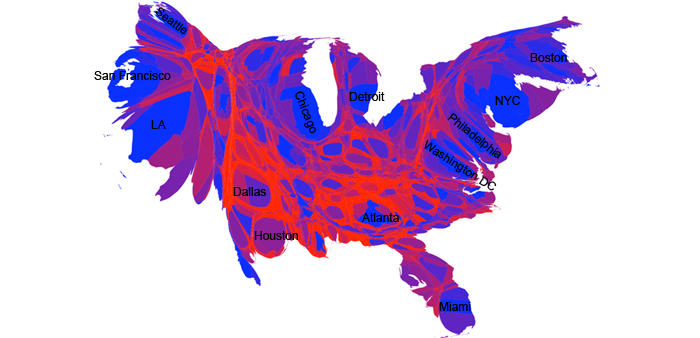
Cartograms, "transformations of a map where the original polygons expand or contract their area based on an attribute value they have," can tell remarkable stories. In Newman's cartogram, above, counties are scaled based on the size of their populations and colored based on the proportion of democratic and republican votes. Besides being able to see how many people actually live in urban areas, this cartogram shows how people tend to vote there too. More analysis and a comparison to the 2004 election can be found on Newman's site.

(Cartogram by Mark Newman. Version with labels available from flickr.
No comments:
Post a Comment