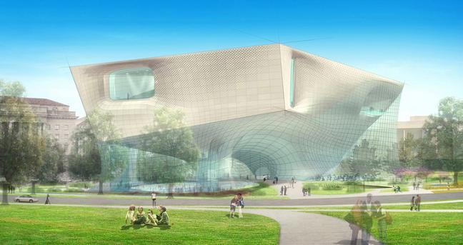
Submissions have just been unveiled this afternoon for six innovative entries in a competition to design the planned Smithsonian Museum of African American History and Culture, a $500 million project scheduled to open in 2015. The six competing teams are: Devrouax & Purnell with Pei Cobb Freed & Partners; Foster and Partners with URS; Diller Scofidio + Renfro with KlingStubbins; the Freelon Group, Adjaye Associates and David Brody Bond with SmithGroup; Moshe Safie and Associates with Sultan Campbell Britt & Associates, and Moody Nolan with Antoine Predock Architect.
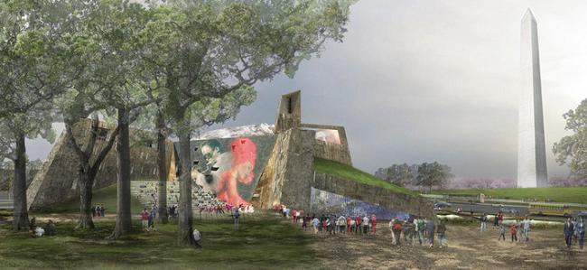
Above is a rendering of Diller Scofidio + Renfro and KlingStubbins's avant garde submission; a rendering of Moody Nolan and Antoine Predock's proposal is below. Looks like the Smithsonian -- a fairly traditional institution, when it comes to architecture -- is planning to give the National Mall a bit of archi-juice. And we thought the National Museum of the American Indian's building was a departure!
 It's always refreshing when, once in a blue moon, all of the entries in a competition are genuinely interesting, no?
 (Photos from the Washington Post.)

14 comments:
But what if thinking outside the box is the box. Too much attention-grabing wackiness for me.
The Foster design is the only beautiful one in my opinion. By far the best.
Dan - I totally agree; the Foster design is the most pleasing. The rest are trying way too hard.
I think the design should stem from some fundamental image/form/idea in African American history rather than throw the museum inside a shell that has nothing to do with the its contents or purpose. Shouldn't the African American community have a large say in a museum that is long overdue in DC?
I'm of the opinion that Foster's designs are always so popular when released to the public merely because his people are very, very good with renderings. His finished buildings always seem garish to me. Think of how slick Hearst Tower looked in renderings...and now go look at a picture of how clumsily it sits on its beautiful old podium, like a fat clown on a Louis XIV chair. The images for this competition entry are nice (or the first one is, anyway) but Foster doesn't deliver when the bricks are laid.
That being said, I'm in total agreement with the statement that "thinking outside the box is the box" with a lot of contemporary architecture, but I think this is an especially interesting case because of the setting. The East Wing of the National Art Gallery and the aforementioned Native American museum being notable exceptions, the Mall is one of the least architecturally innovative places I can think of. It's impressive, but hardly challenging. It could use a kick.
Predock is my favorite architect, but I'm not at all fond of his entry here. My favorite is the Freelon/Adjaye/DBB/SmithGroup proposal.
Robert - check out the WaPo article...buried at the bottom are explanations of the symbolism and iconography behind each proposal.
My first reaction was: what do some of these designs have to do with African American culture and history? As Robert said, the design should reflect and enhance the content and purpose of the museum itself and the people whose culture and history it is supposed to reflect and promote. That said, why should a museum on this theme necessarily look different than a museum on mainstream (White European and American) culture and history? I think the process is very important in determining the outcome - this is a public symbol, not just an artistic statement, so there should definitely be community consultation.
I was just at the American Indian Museum earlier this afternoon. I've been there quite a few times, and every time I just can't help feeling like something is really missing there. The double barrel gift shop approach is a bit much. It's hard to tell you're in something other than a shopping mall until you get to the third floor. The color is just wrong too. It's kind of hard to figure why they put a yellow building that's evocative of the southwest in the middle of Washington. It looks very out of place from near the Capitol especially.
The East Wing of the National Gallery is a great building, but Pei was also responsible for the hideous and inhuman mess of called L'Enfant Plaza, so I'm always wary when I hear his name.
Foster's courtyard for the Smithsonian American Art Museum is a superb place, and I like his proposal here the best ( I think they all pretty much suck though) so I hope the jury goes with him and gets him to clean it up a bit.
That site is far too prominent for some weird box that is going to look like hell and be an embarrassment in 20 years. THe Hirschhorn, which people here seem to be forgetting, was in really sad shape for years before its recent renovation. Quite a number of its problems had to do with it being an "innovative" building.
Isn't this from that part in Logan's Run where the runners come up from the underground society and we find out that Sanctuary is really just Washington DC in ruins?
It's hard for me to get a sense of how they would look built, but from the renderings I like the one by Diller and Scofidio. It's kind of like a half-angular cowrie shell breaking out of a net.
As a retired architect, The Moody Nolan/Predock design is more natural looking from the other five submitted. The Moody Nolan group has displayed quality work and careful detailing in all their designs. They are a well known firm located in Columbus Ohio and do excellent work locally and elsewhere. I recommend them for this project.
The Moody Nolan/Predock entry is by far the most dramatic of the group. It shows a great mix of exciting inside and outside spaces. Some of the others are bland by comparison.
The Moody Nolan/Predock design is the best of the lot. Whereas all the other entries try to conform to the norm, this design stands out in its imaginative use of the context and its ability to tell a powerful story in a contemporary architectural language. The creative use of materials and the amorphous yet poetic form of the building will be a great addition to the Mall.
Like most of Foster's designs, this looks like an engineering "solution" to an architectural problem. Moody/Predock is by far the best.
The Moody-Nolan rendering has a truly organic feel to it which allows the observer to take from it what their mind would allow. It shows strength, struggle, and prosperity among other things. I feel it is the best design of the group.
Marvin Marion
I like the Moody Nolan rendition because it actually displays a piece of the history that will be housed within the structure. Rev. Ajabu
This is a very interesting group of submission and I have studied each very intensely but one rises above all. Moody Nolan design is very organic and at one with the environment. I loved the mural on the outside and the grassy roof. Unlike some of the other designs, there is lots of glass but it is not very apparent. The glass brings in light, brings the outside in and breaks up the concrete. It is by far the most artistic. If this competition is about design that incorporates the contemporary but more importantly reflects the nature and history of the African American culture as well as it’s relationship to nature, then Moody Nolan is head and shoulders above the rest.
Post a Comment