Showing posts with label landscape architecture. Show all posts

7.18.2009

The New High Line

Photo of the High Line pathway

The High Line is an elevated park that runs along a portion of Manhattan's west side. It was once a railway, in use from 1934 until 1980. As vegetation took over, it became an informal and (not completely) inaccessible greenway above the streets. Neighborhood residents Joshua David and Robert Hammond started Friends of the High Line in 1999, hoping to save the structure from demolition and build support for the park idea. The city approved funding in 2004, and the lower section (from Gansevoort to 20th Street) opened in June.

Photo of trees and benches along the High Line

The park was designed by James Corner Field Operations, Piet Oudolf, and Diller Scofidio + Renfro. It is made up of pathways that weave through the original train tracks, as well as diverse plants inspired by those that grew in the absence of maintenance. The city plans to continue the park along the Hudson Yards to the Javits Convention Center. According to Mayor Bloomberg, the first section has sparked considerable neighborhood development, with more than 30 new plans now in the works. The Whitney Museum is building an extension by Renzo Piano at the Gansevoort entrance.

Photo of plantings along the High Line

On a recent visit, I was impressed by the High Line's varied landscape and playful atmosphere. It offers a different perspective on the city, where things come into view that are usually hidden from street level. The path moves along and through buildings, creating excitement in the discovery of new environments.

Photo of the theater onto the street at the High Line

The architecture is kind of slick, but it also has a relaxed, inventive feel that plays well against the seasoned ruggedness of its surroundings. I really like the idea of including the original train tracks. This might be even better if their continuity could somehow be maintained. They currently seem like set pieces rather than historically integrated parts of the neighborhood. I loved the rolling chairs on tracks, and the vegetation is tough and beautiful. The spectator windows onto the street (or into the park) are an interesting concept, framing everyday life as entertainment. However, I'm not sure the frames and stepped seating add much to the view, and they seem to draw energy away from the path. These opinions, however, are especially inconsequential in light of the overall greatness of the park.

Photo of rolling chairs on tracks at the High Line

The High Line is a wonderful part of the city's changing ecology, one that builds upon the old in shaping the new. I recommend starting with the exhibition Mannahatta/Manhattan: A Natural History of New York City at the Museum of the City of New York. It includes detailed reconstructions of the island before modern development, giving a sense of how our current moment fits within the area's unfolding story.

(Photos by Peter Sigrist)

3.07.2008

WEEKEND READING: March 1-7, 2008

Let's shake things up a bit this week. Instead of summaries of the seven Weekend Reading items, how about some teaser quotes?

ITEM ONE: "It's interesting to see the major changes in our urbanism - as well as to see the fact that the inherent nature of place is difficult if not impossible to erase."

ITEM TWO: "Now that the George W. Bush era is almost over, the world needs a place to archive the legacy of the 43rd president...If you felt your vote didn't count in 2000, it will certainly count here." (Photo credit)

ITEM THREE: "As February gives way to March, Brand Avenue begins its third year online! A few highlights and/or personal favorites from the last year."

ITEM FOUR: "The New City YMCA, where Jeremy played sports for free after school, has come down, and the basketball courts—the great equalizer, where rival factions of the Gangster Disciples would come together to play—have been replaced with a Blockbuster, two Starbucks and a grocery store that has its own sushi station. 'Those courts brought the community together,' says Jason. 'All of this thrown out for condos.'"

ITEM FIVE: "Eventscape's Kapsel is a multisensory functional space that can be set up anywhere in a busy office or elsewhere to create an oasis of relaxation and calm. Based on a lightweight tubular frame, the space can be skinned in any material, with no restrictions on size or form."

ITEM SIX: "Is there an architectural paranoia? And, if so, what would the treatment be – walking tours of all the unmarked buildings downtown? Nights spent alone with your psychoanalyst in empty suburban houses?"

ITEM SEVEN: "Active Social Plastic takes on cultural ephemera, turning its lens to architecture, urbanism, design, interaction, landscape, music and literature, among other leanings."

Have a great weekend!

2.01.2008

WEEKEND READING: January 26-February 1, 2008

Bienvenidos a la fin de semana. Let's get to the good stuff:

ITEM ONE: I can't bring myself to link directly to "Reason" Magazine, so here's a post from the Center for Global Development on a very interesting interview on immigration policy with economist Lant Pritchett.

ITEM TWO: Strange Harvest visualizes what wireless communication technology might mean for the urban environment.

ITEM THREE: Pigs Will Fly examines the importance of local green economies.

ITEM FOUR: A beautiful piece from the NY Times on the art of decay in gardening. (Photo credit)

ITEM FIVE: TNAC lambasts Forbes' pathetic, poorly-executed disgrace of an article on the "10 most miserable cities in America"...

ITEM SIX: ...and we'll follow that up with a hilarious and spot-on column from Mark Morford of the San Francisco Chronicle entitled "Study says many studies suck." WORD.

ITEM SEVEN: Another good blog to add to your Reader -- Landscape Urbanism. Check it out!

Go have a party and then wake up at two in the afternoon tomorrow and read some of this stuff. Or something.

12.31.2007

Best of the Urblogosphere: 2007 Round-Up

I went back through all of the Weekend Reading posts from the past year and pulled what I thought were the very best of the best. I've divided things up into two categories: General Urbanism and Place-Specific posts. Descriptions of the selections are followed by their date on which they originally appeared in WR.

GENERAL URBANISM
ITEM ONE: BLDGBLOG on "terrestrial reorganization" during WWII. (April 20)

ITEM TWO: Celsias on why designing cities around cars is such a terrible idea. (May 18)

ITEM THREE: Harvey Feldspar's city-hopping geoblog of the future, from Wired's examination of the future of our mobile society. (June 29)

ITEM FOUR: London architecture criticHugh Pearman on the Tate's megacities exhibit -- a stunning critique of contemporary starchitecture. (July 14)

ITEM FIVE: This Airoots post explores a fascinating artist's village in Mumbai. Organic urbanism at its best. (August 24)

ITEM SIX: NY Mag sets the record straight on Jane Jacobs' legacy. (September 28)

ITEM SEVEN: The Next American City features an article about how violent foreign policy creates more violence at home. (October 12)

ITEM EIGHT: City of Sound reexamines cities as destructive systems. (November 2)

ITEM NINE: Fabulous imagery of re-imagined slums via Subtopia. (December 7)

ITEM TEN: Spacing Wire features this beautiful and concise argument for humanism in the environmental movement. (December 14)


PLACE-SPECIFIC
ITEM ONE: A New York Times feature on the evolution of Curitiba into a poster child for good urbanism. (May 25)

ITEM TWO: Built Environment Blog takes a bike ride through ever-fascinating Brooklyn. (June 1)

ITEM THREE: The Economist goes back to Beijing. (August 24)

ITEM FOUR: Fabulous article from Frieze on the Brazilian megacity of São Paulo. (August 31)

ITEM FIVE: The Lincoln Institute explores post-apartheid Johannesburg. (October 5)

ITEM SIX: BLDGBLOG's rather infamous paean to the wonders of Los Angeles. (October 19)

ITEM SEVEN: More great stuff from Spacing: an Angelino's take on Toronto's messy urbanism. (October 19)

ITEM EIGHT: And finally, an Airoots post on the architectural wonderland of Tokyo's retail scene. (December 7)


If there are any of these that you missed the first time around, I urge you to take a look...they're great reading, start to finish. Have a wonderful, safe, and happy new year! See you in 2008.

(Photo from Non-Photography.com. The original full-color version can be viewed by clicking the photo.)

12.03.2007

The Craig Hartman Interview - Part I

The following interview, in which SOM San Francisco design partner Craig W. Hartman, FAIA, discusses his firm's plan for the redevelopment of San Francisco's Treasure Island, was conducted in two parts. The first two questions asked by Where, as well as Mr. Hartman's first answer, have been copied directly from an email exchange. We then switched to a telephone conversation, which begins here with Mr. Hartman's second answer. The interview will be posted in two parts that do not correspond with the change in conversation methods, but rather split the text into two even halves.


----------------------------------


Where: As big-ticket and high-profile as SOM's proposal for the redevelopment Treasure Island (TI) is, it looks like it belongs on its site in the way that all great projects do; from what the renderings show, it's the kind of development that, when finished, could become a part of the city in a way that that makes one wonder what the place was like before the project was built. But what's most fascinating about TI is the fact that, even in a city with such incredibly rich architectural and cultural traditions, the site seems to have lacked traditional contextual cues. So what was the starting point for designing of this development?

Craig Hartman: The starting point wasn't a question of aesthetics – or even architecture. The question was what have we learned, collectively, about intelligent forms of human settlement that should be applied to this place? What are the possibilities when a community is developed as a singular idea as opposed to incremental growth? Can we conceive a holistic urban ecology that goes beyond sustainability – sustaining existing conditions - to be regenerative? Can we plant the seeds of an ecology that brings together stewardship of the natural environment, diversity (not only human but species diversity) along with social and cultural vitality and what kind of urban and architectural form would support these aims? In short, given the chance to start from tabla rasa, what might a 21st Century neighborhood representing the values of San Francisco look like?

The setting is an inversion of [what] might be typically thought of as urban context. The site itself is synthetic - a recycled manmade artifact in which the earth's topography is an artificial flat plane and the structures, for the most part, conceived as temporary shelter. The island was built contemporary with the Bay Bridge as a manmade extension of Yerba Buena Island. Some of Treasure Island's fill came from the tunnel cut through Yerba Buena. The island's first wave of architecture was the temporary fantasy created for the 1939 International Exposition and the second, also intended to have a short shelf life, consisted of the structures created to accommodate the Navy's occupation in World War II.

So the real "contextual" influence was the vast horizontal plane of the Bay, the City of San Francisco skyline to the south and the drama of the weather pattern sweeping through the throat of the Golden Gate and across the island on a daily basis. Wind, fog and sun are the determinants, along with the physical reality of the subsurface geology and the desire to create a place that is compact and walkable - highly accessible to mass transit, culture and urban amenities on one hand and a variety of open space on the other. To achieve this required an interweaving of low-rise and tall buildings, a variety of open space typology and a fine grain of streets and pedestrian pathways.


W: I know that "context" has become something of a dirty word...or at least a word that has sort of lost most of its meaning in architecture since no one can really seem to agree on what it means. This is lamentable, I think, since the concept itself has been forsaken for a semantic argument, and sometimes it feels like the whole idea of a buildings responding to the sites on which they're built gets waylaid in the process. At any rate, the strength of the TI plan is that it draws from its surroundings without trying to mimic them. One of the most interesting things about the plan is the way that the wind patterns were used to determine the organization of the buildings and the open space, and how the grid would be canted. (The architectural romantic in me loves the concept of a "city shaped by the wind"). I'm interested to know how the other intangible factors that you brought up -- sun, fog, geology, even the cultural values of San Francisco -- helped to define the physical environment in the project.

CH: I agree that context doesn't have a lot of currency in architectural discourse at the moment, and it's not really surprising because contextualism in the [1990s] got branded as a style, an architectural style, and it became a crutch, as these styles often do. Specifically in the case of contextualism, in my observation at least, it became a code word for a lukewarm architecture that tepidly reflected history rather than authentically addressing its place, and I think the outcome of that was that originality and innovation really took a backseat to timidity. So I agree with that point but I also would suggest that the work we're doing at Treasure Island is based upon context, but context that has a larger meaning and is more broadly considered. Context might be considered both as physical and cultural, and the physical landscape includes the natural as well as the built environment.

The other point that I would make before getting into the specifics of context for TI is that by now, at the beginning of the 21st Century, we've learned some lessons from the past about forms of building, the effects of consumption and the nature of human habitation. Buildings consume the majority of energy production and emit the majority of the carbon dioxide in the world - and the second [largest source of these things] is our cars and transportation. Add those two things together with sprawling, consumptive patterns of development and we get the environmental crisis that we have today. So clearly, if we address the questions of the way we settle and the way we move we can begin to address our major climate problems. All those things were part of the consideration of context for this island


W: You talked earlier about what you referred to as a "regenerative urbanism." How does TI take architecture that step from sustainability to actually being a regenerative urban place?

CH: Well that would be, perhaps, a hopeful term rather than an absolute metric. I think most environmentalists would say that it's very difficult to make an urban environment truly regenerative because "regenerative" would suggest that you're not sustaining merely current conditions but, through the work that is being produced, you've actually initiated a mending or healing of the environment. Treasure Island has been inhabited by the Navy since the early 1940’s. Their use of the island has been very pragmatic, based upon the most expedient and efficient operational pattern of the time. Militaries throughout history have not exactly been noted for their gentle use of the land. Like perhaps most of us, the Navy was not very mindful of consequences of certain material use, the way that rainwater runs off the island into the Bay and not really mindful of the energy that is consumed, because all of those resources were thought to be plentiful and... [Searches for the right word]

W: Self-replenishing.

CH: Exactly. And we now know that all of these things have a finite quality, or that they are part of a system that is recycled continuously. So what we tried to do here is to take this manmade island and bring it to a level that it had never achieved before. This includes naturally cleaning water that strikes the surface when it rains through bioswales in the earth, purifying it by a natural means. It also includes minimizing water that is consumed on the island, maximizing recycling of water that is used and being certain that all water that does make it back into the Bay is clean. [We are also] generating produce on the island with organic farms and in the process, making a place that supports a diversity of species that includes not only a healthy environment for humans but also supports the widest possible variety of others; birds, animals, reptiles and so forth. It's meant to be an incremental example of the way that we can coinhabit urban spaces with nature and with a wide and varied organic diversity – people, plants, animals. And this urbanistically, the goal is a vital human social and cultural diversity.


W: Im interested by the way that you talk about integrating the two halves of the [built environment] and the natural environment because there's a lot of public space on the island in your plan, and the density of the built areas is really high which allows -- I think -- more than half of the island to be left open, right?

CH: That's correct.

W: And I thought when I was reading about it initially that it was really interesting that nowadays [in] most developments the centerpiece will be a mall or a commercial district, and it's always retail, retail, retail, kind of like a drum beat. What I thought was really interesting about TI is that most of the public space is not really oriented toward commerce but more toward...natural settings. Was that something that was [done consciously]?

CH: That was absolutely a guiding principal when we got into this. We had the opportunity of coming into this project relatively late in the process in terms of the design. There had been a previous design for the island that was based upon a lower density [with] housing spread out across the island and a kind of greensward that wound through the middle. It wasn't meant to be suburban but I think that was the outcome. My colleagues and I at SOM were asked to join the team when an additional development entity was added to the team and after the project had gone through a lengthy public review process in which many issues had been raised. We joined an existing team that included SMWM, architects and planners and CMG, landscape architects along with an array of high level engineers including civil and Arup who focused on sustainable engineering and transportation strategies. Also added at that time were BCV architects who focus on retail and Hornberger Worstell who focus on hotels.

There are many stakeholders and interested parties whose opinions a perspectives must be considered in any San Francisco project, and especially one of this scale, prominence and importance. There are official agencies specifically set up to govern and critique the development, beginning with the Treasure Island Development Authority and the TI Citizen’s Advisory Board along with City Agencies such as the Planning Department and the Department of the Environment and various California State jurisdictional bodies. There are also advocacy groups and concerned citizens. A consistent concern shared by all was that the future of this island needed to be based upon sustainable urban principles. So pretty late in the process, only about a year ago, when we got involved with this we benefitted, really, from what had been a lot of critique -- very constructive critique, I think -- by the community, and that really helped. It gave us the ability to have some leverage in the process. The development team was very much aligned with these principles and wanted to make it happen.

Perhaps the most important concept we brought to this is the making of a very compact urban space focused on mass transit and aquatic mass transit -- the ferry. We repositioned...the ferry key on the west side [of the island], as close as possible to San Francisco’s Ferry Terminal as opposed to the back side, where it had been proposed. Then [we worked] to really densify or compact the housing through the selective use of tall buildings placed to focus density for social purposes or for ease of access to transit. This concept allowed us to have the great park.

The park is different from the parks of the 19th and 20th century, to a certain extent, in the sense that it has multiple uses and characteristics, from natural and wild to cultivated and urban and is not only recreational but also has pedagogical and productive elements. There is a structured recreational area, but structured recreation requires a lot of irrigation, so that is also compact and designed in a way that it can be multi-use. We also worked on making parts of the island productive – a 20 acre organic farm that visitors can actually walk through and experience as a “farm to table” pedagogic tool. Then vast amounts of [the green spaces] are simply wild lands that are shaped to allow natural systems to operate, like tidal pools that support a diversity of species types. So that was a guiding goal here: to minimize, as much as we possibly could, our ecological footprint, and maximize the environmental potential.


W: I thought it was really interesting that, in addition to there being a lot of it, it doesn't seem like the [green space is] just tacked on. It's worked all throughout the project and sort of integrated throughout the entire island, and I thought one of the most interesting ways that manifested itself is in the rotated grid and how the landscape is used as a buffer for the wind. That struck me as really interesting and I was wondering if you might talk more about that.

CH: That's a very good observation. This island is a beautiful setting -- an unbelievable setting -- so the views from the island are extraordinary. But it also suffers the brunt of all the major weather coming in from the Pacific, right through the Golden Gate passage. There are very powerful photos of the fog coming through that passage and sweeping across the Bay but you have to spend a lot of time on the island to really understand the effects of constant wind. It's a very uncomfortable feeling so at the very beginning the idea was to make this place habitable in a comfortable way and to look to nature and traditional agrarian techniques for ways creating calm and sheltering occupied spaces.

The first thought was to simply create the quality of sand dunes on the westerly side that would reflect the wind upward. We found that that does have an effect, but it's a fairly micro impact. And we are doing that - creating a shaped topography on the west side that creates localized calm areas. I think its very interesting, especially the way Kevin Congerland of CMG developed the idea as a clearly manmade geometry that operates as dunes and swales do in wild landscapes.
But in the urban areas, the neighborhoods, the technique we found most effective was to place the buildings themselves so that they sheltered the public spaces on the leeward side. Through work with RWDI, the wind consultants, we found that there is roughly a 15:1 relationship between the height of an object and the distance from that object that one could expect relative calm on the leeward side.

The first and most obvious fact is that the wind is coming from the west and the island is tilted upward to the north by approximately 32 degrees off of due north. So that creates this angle that you see as the main organizing structure in the island's grid plan. We have turned all of the major streets in that direction and have placed the buildings so that they are creating buffers along that edge. Borrowing from agrarian traditions in which wind rows – trees - are used to create sheltered areas to protect croplands which you see in our own country and also in Europe. We've simply taken this idea and extended it through the urban space to the open space as a wind buffer. So, on one hand, its nature and on the other, architecture, that does the work the work of creating calmed and sheltered public space. To further this concept, we staggered the streets in the other direction so that we're not creating wind channels.

This shifted, or bent grid, orients the principal public spaces and streets to the south, bringing the maximum amount of sunlight directly onto these spaces for the maximum hours of the day. That's a very important thing, to have sun in these spaces, because the wind and fog is so prevalent, resulting in cool temperatures most of the time. The fortuitous thing is that the 32 degree angle, directly to the south, also opens view corridors directly onto the city of San Francisco. It creates a really powerful connection between the island’s public spaces and San Francisco’s skyline.


W: So the view down those streets looks straight at the city, then. The view down the street would kind of frame San Francisco.

CH: That's correct. The angle frames the city, and brings high south sun on the island streets. Perhaps the other point worth mentioning is your comment about how the green space is woven through the urban, the wild and the organic, agrarian parts of the island. That was a very conscious idea, to create a purposeful set of varied and interwoven public spaces including an art park, urban spaces, organic farm and wild lands, all linked to the windrows. One of the most important for the social life of the island is a series of small urban parks we have cut into the neighborhoods. These are small -- approximately a half-block -- in size. With their scale and the placement, the intention is to create a social nucleus or focus for smaller-grained neighborhoods throughout the larger community. So the neighborhoods and the island’s social life become an integral part of the island’s environmental and ecological agenda.


----------------------------------


Tomorrow Where will feature Part II of this interview, in which we delve into the social and community aspects of the TI design, as well as the architecture. Don't miss it!

Links:
Bending the Grid (SOM) (photo credits)

11.07.2007

Review: The Tennessee Valley Authority (Guest Post by Chris Timmerman)

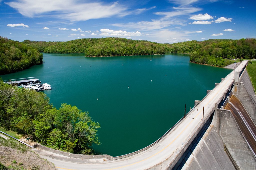
As a child, architect Tim Culvahouse looked forward to the weekly drive to his grandparents' house, particularly the part where the landscape began to change ever so slightly:

Around one bend -- the one I looked for, my signal -- the ragged cuts gave way to gentle, carefully tended grass slopes, slipping smoothly into the dark pine woods. The road rose to the left, cruved back to the right, over and down the hill, then up and down again in long sweeps through the tidy forest. Rounding the final hill, we dropped down between concrete retaining walls, through the face of a bluff, and out into the open…We were in The Country.

Riding in the back of that 1959 Ford...I enjoyed the gentle roll and curve of the road into Watts Bar Dam. It did not occur to me then, and not for thirty years after, that the curves and the ups and downs of that road were
designed.

Culvahouse grew up in and around the landscape of the Tennessee Valley as it was progressively altered by the plans of the Depression-era Tennessee Valley Authority, and it is his family’s story that forms the starting point for the book The Tennessee Valley Authority: Design and Persuasion, for which Culvahouse served as editor. The book’s essays offer a fascinating look at the development of America’s largest modern-day electricity provider through the lens of regional planning and architecture.

Spanning seven states and 24 dams, the development of the TVA was a massive project affecting millions of people. Not just a feat of engineering or America’s grandest planning effort, the TVA sought to bring economic development to one of the country’s poorest regions, through flood control and the generation of electricity.

The aims of TVA administrators and designers were equal parts heroic and problematic, globally aware and regionally sensitive, and these impulses bear themselves out architecturally -- in the unrepentant Modernism of dams themselves; the eclectic architecture of the thousands of homes required to house those displaced by the flooding of the Tennessee River’s bottomlands; and the graphic standards developed for all TVA materials. Steven Heller’s chapter on TVA graphics and Todd Smith’s chapter on the TVA’s visual art campaign are particularly compelling in their descriptions of the complex charge behind the aesthetics of such a massive undertaking. A look inside the TVA’s architects offices in Knoxville by Christine Macy illuminates a productive tension between local and global design considerations, while Jane Wolff’s discussion of the TVA’s transformation of the Tennessee Valley landscape underlines the fact that the land itself was intended to become, through clever manipulation, what would transform the region, physically and culturally:

[The TVA] reinvented the Tennessee Valley as a collection of idealized scenes—rustic, pastoral, and monumental. The places that the TVA created argued for its agenda. Meant to look as though they had always existed, they declared that progress was not at odds with tradition, that old images and new technologies could be integrated, and that history and geography were continuous and coherent. The agency’s terms for the landscape were so internally consistent and so convincing that its rhetoric was barely questioned.

Culvahouse points out that this wholescale approach to regional development was not without its flaws:

Of course, not everyone was convinced. The intricate weave of people’s lives in the landscape does not readily admit comprehensive visions or earthly utopias….Resentment of the TVA’s reengineering of the region lingers there. But just as certain are the benefits to the region, rich in new ways of intertwining our lives with the land.

The book is valuable reading for any design professional who thinks they can foresee the ramifications of any grand transformation, and is particularly apt in an age of new regional transformations from Dubai to Shanghai; grand civic schemes like the 2008 or 2012 Olympics; new parks from New York to Toronto to LA; and of course, the fervent, ongoing, perpetual search for more energy.

------------------


Big thanks to Chris Timmerman, the blogger behind Brand Avenue, for writing this guest post! Check out Chris' blog for more great insights on "place, space, and identity."

(Photo from Flickr user Robby Edwards. The original full-color version can be viewed by clicking the photo.)

10.26.2007

WEEKEND READING: October 20-26, 2007

No good news on the laptop front...the machine is very dead, but whether the files on the hard drive are salvagable or not is a mystery until next week. In the meantime...

ITEM ONE: Built Environment Blog chimes in on the Atlantic Yards megadevelopment in New York with a brief history of the Superblock.

ITEM TWO: The Map Room features João Machado’s colorful map creations.

ITEM THREE: The Affordable Housing Institute highlights a series of articles from the Times of India that illustrate how myriad urban problems in Mumbai are interrelated.

ITEM FOUR: Does Big Development kill the American Dream? The American thinks so (and I agree!).

ITEM FIVE: Richard Florida's new report (with Tim Gullden and Charlotta Mellander), The Rise of the Megaregion, presents us with a whole slew of new opportunities for "BosWash"-esque portmanteaus -- and some kickass demographic images like the one at the top of this post.

Have a great weekend, everyone! Hopefully I'll be able to get my paws on a laptop for Urbanffffinds on Sunday.

9.27.2007

Bizarrchitecture

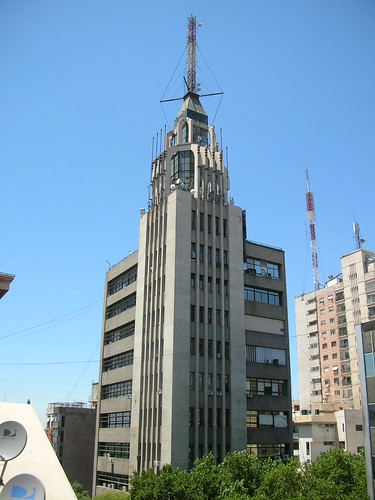
Rising 177 feet over the Argentine city of Mendoza is Edificio Gomez (built in 1954), which is one of the most...interesting buildings I think I've ever come across.

Before we get into Gomez, though, a bit of background on Mendoza. The city, home to approximately 111,000 people (with 850,000 in the metropolitan area), is located at the foot of the Andes and is known for its exquisite beauty -- it's nickname is "The Oasis City." It started out in 1561 with the traditional 5x5 block town plan surrounding a central square and Catholic church that the Spanish used for basically every city they built when colonizing South America. The dimensions of this plan (streets, sidewalks, lot sizes) were notoriously rigid, leading to a rather uniform look to the central areas of many South American towns. But when a massive earthquake leveled Mendoza in 1861, it was rebuilt with much more generous spatial allottments. Sidewalks and streets were widened, trees were planted, more expansive plazas laid out, and one of the city's most unique features -- a series of stone irrigation ditches that run along the streets to water the trees -- was created. In fact, Mendoza is considered by some to be the most beautiful city in Argentina -- a steep claim, considering that this country can claim the likes of Salta, Tucumán, and Buenos Aires (the Paris of the Americas).

So, with a reputation like that, how does Mendoza explain Edificio Gomez? Just look at this thing. It's...I don't even know what it is. It's bizarrchitecture, that's for sure. The verticality of the campanille is impressive...I'll bet the thing looks three times its height from the sidewalk. Or at least it would if the architect hadn't wrapped it in an industrial riverfront warehouse from Cleveland circa 1940. Seriously, what is that? And then there's the crown, which is...it's just sublime. The above photo was the first image I'd ever seen of the tower, with the crown peeking over the trees in the central Plaza España. Without the bulk of the building, the crown has an instant "Holy hot spiky messes, Batman, what IS that?" effect. It looks like the bastard child of Antonio Sant'Elia and Fritz Lang. Or of their buildings, anyway. Whatever. Words fail.

From what I can gather, the building was designed by someone named Civit, who "based" it on the art deco towers of 1920s Manhattan. At first, when I read that, I got excited at the prospect of the Forgotten Continent (oh please, everyone both knows and cares about Africa; but who can find Bolivia on a map?) coming complete with its own forgotten Insane/Visionary Modernist Architect With a Vaguely Industrial-Sounding Psuedonym (Corbu del Sur!). Alas, the guy's full name was Manolo Civit. How droll.

Honestly, I am totally crazy about this building, and I can't really figure out why. It doesn't even really fit in the ugly-chic category that Jean Nouvel has been blazing a trail through lately. It lacks the self-awareness and the extra three pieces of flare. Perhaps it's the fact that it's utterly unique? Or that it looks like the watchtower-clubhouse of an eccentric and reclusive manchild? Or that they light it up at night like some kind of baroque prison Christmas tree? I don't know. It could be any of those things. I just know that I like what I see.

There have been several recent articles and blog posts listing the authors' nominations for the world's ugliest buildings, and I think that it's worth noting that Edificio Gomez didn't make any of them. Granted, that might have something to do with the fact that it's an extremely obscure building from an obscure city in a country that I'd be willing to bet at least 50% of "US Americans" have never heard of...but let's give Gomez the benefit of the doubt and say that it missed the lists because it is not, in fact, ugly. Instead, it is just completely bizarre. And really, that's much more fun anyway.

At any rate, stumbling on the Edificio Gomez has me wondering what other wacky architectural curiosities are hiding out there in the gazillion little cities around the world that I've never heard of. Is there such a thing in your city? If so, please share. In the meantime, let's enjoy Gomez in all of his...erm...glory.

(Photos from Panoramio users Emiliano Homrich [1] and Leandro Luis Targon-Gomez [3], and Flickr user elpollo [2].)

9.04.2007

The 21st Century Park

“A 21st-century park is something very different from what Frederick Law Olmsted imagined when he won the competition for Central Park in the 19th century. We have the Internet, we have computer games, we have people flying to Hawaii for vacation, so a park in the 21st century has to be a wholly new kind of thing...I hope that we cast a wide enough net to get truly the first park of the 21st-century. Shelby Farms is certainly big enough to be something very special.”

This little nugget of hubristic bombast comes from Alex Garvin, a former LMDC official (*ding*, red flag), in reference to his current project: a revamp of Shelby Farms Park, currently a twinkling RFQ in Memphis' eye. As it stands, the 4,500 acre park is currently used for a variety of recreational activities, as one might expect for such a huge space. The Shelby Farms Park Alliance describes the park as encompassing "lakes, paved and unpaved trails, forests, meadows, an Agricenter, a farmer’s market, a horse arena, a visitor center, rental horses, skate boarding, disc golf, dog off-leash area, senior gardens, a natural area with a river running through it, a restaurant, government offices and even a prison."

Heh...someone really knows how to end a list and start a party.

At any rate, Garvin was originally brought in to develop a master plan for the park that one can only assume was originally intended to have some sort of developed component. But Garvin's suggestion was to shape the rough natural spaces into the majestic, high-tech Versailles of the Future described at the start of this post. So now the RFQ is calling on L-archies big and small to come up with a way to turn a subdivision-ringed area that claims to be the largest urban park in America into a fully-functioning greenspace-masterpiece-extravaganza. Sounds like a thunderous disappointment waiting to happen, no?

There is naked ambition evident in Garvin's blustery prophesy of trailblazing landscape architecture; the Shelby Farms Park being (vaguely) envisioned is grand, expansive, and very, very important. Yet the conflict of a park five times the size of Manhattan's Central is inherent in Garvin's own description of the challenge. The internet, computer games, and increasingly affordable transoceanic flights are all smaller pieces of the larger problem of technology's tendency to pull or even drive us apart. The logical solution to this problem, in terms of parks and other public spaces, would be to create engaging and inviting parks that, by design, bring people together. To achieve this, theoretically, a designer would need to work on a very human scale, focusing on details that would inspire interaction. To suggest that this can be done over a stretch of 4,500 acres implies a fairly rosy tint to one's glasses.

In fact, "humanly scaled" is most commonly used to describe the very un-grand side of urban design. The human scale is best suited to smaller spaces: pocket parks, plazas, paseos, grottos, playgrounds, and neighborhood gardens. These small spaces very frequently serve as local gathering places, reinforcing the importance of community in the larger context of the sprawling, technologically advanced megacities of the 21st century. They provide a sense of scale (there's that word again), reminding city dwellers that they are a part of something smaller than the cities in which they live. This is vital to city life, and these places are well-used because they are easy to fill up. That sounds a bit circuitous, but the fact is that the places most enjoyed in cities are the places where there are a lot of people around. A healthy amount of people-traffic makes us feel safe, and smaller public spaces are easier to keep busy, plain and simple.

That's not to say that large parks can't work. Central Park in Manhattan, Lincoln Park in Chicago, Hyde Park in London -- all of these are wildly successful urban parks not merely because of their beauty, but because of the high density of the neighborhoods that abut them. These parkside neighborhoods generally hold at least 50,000 people per square mile, roughly the density Jane Jacobs suggested as ideal. But this is yet another example of proper scaling: huge numbers of people require more space to spread out. If, following conventional wisdom, the Upper West Side is the traditional town writ large, then Central Park is the resulting exaggeration of courthouse square.

In addition to the incompatibility of Shelby Farms Park with its surroundings (in terms of creating a great urban park) there are issues of accessibility. The 754 square mile Shelby County, in which the majority of the Memphis area's residents reside, has a population density of just over 1,100 people per square mile. In short, the Memphis area is fairly spread out. With Shelby Farms Park located at the eastern edge of the metro -- 10 miles from downtown Memphis at the closest point -- the only access to the park for almost everyone in the region will be by private automobile. Even ignoring the implicit socioeconomic segregation, this location fails, through inaccessibility, to address any of the problems brought on by increased technology. It is merely a sprawling green space surrounded by sprawl. No matter what the park looks like, it will be accessible only to select people, and is unlikely to encourage an increased sense of community.

A few hundred miles to the north, another Mississippi River metropolis is struggling with an exacerbated version of the problems facing the Shelby Farms Park redesign. Mayor Slay and other residents of Saint Louis made news recently by suggesting that some of the national park surrounding the Gateway Arch -- the city's greatest landmark and monument to Manifest Desitny -- be redeveloped by reinstating the street grid that once ran right up to the riverfront and building a New Urbanist-style extension of downtown, complete with walkable condo-and-coffee-shop neighborhoodlettes. The merits of this project aside, it is interesting to note what the mayor and other St. Louisians describe as the somewhat infamously placid park's greatest problems: it's hard to get to, and there is not much to do.

In a park as large as Shelby Farms, a solid and cohesive landscape is next to impossible; any attempt would create extreme monotony. There will inevitably be a mix of landscapes surrounding specialized areas of activity. No matter how interesting or innovative they are these scattered points of interest will, at best, see the same fate as the Gateway Arch: they will become islands in an ocean of unused open space. But when all is said and done, what is most irritating about Shelby Farms Park is not that it will be nothing particularly special; there is no rule against gargantuan suburban parks. What is truly frustrating is that ths park claims that it can address the critical issues of landscape and public space in the 21st century, when at the most fundamental level, it cannot. Just call a spade a spade.

***

As we struggle to first define and then combat sprawl in the coming years, it will be interesting to see what kind of meaning that wretchedly overused and woefully misunderstood term -- "open space" -- takes on. It seems important to make some distinction between well-designed parks and public places (streets, riverfronts, plazas, etc.) and rural areas, and the wasted and/or misused areas that are so frivolously and irresponsibly labeled "precious open space" by reactionary neo-NIMBYs. Henceforth, "open space" will be used accordingly in posts at Where, while the well-designed places will be referred to either as "green space" or "public space," depending on their intended use.

(Photo from Flickr user motus media.)


Links:

Shelby Farms to Be a "21st-Century Park" (Architectural Record)

America's Great 21st Century Park (CEOs for Cities)

Shelby Farms Park Alliance

Should the Landscape at the Arch Change? (STLtoday.com)

6.25.2007

Review: The City of the Future Exhibit


I mentioned in last week's edition of Weekend Reading that I'd be making my way down to the Museum of Science and Industry here in Chicago to see the City of the Future exhibit that displayed the winner (Chicago's own Urbanlab) and finalists from the History Channel's competition of the same name. Which I did.

I'm assuming, since this competition was centered around the US' three largest cities, that the exhibit will travel to New York and LA following its time at the MS&I (which ends on October 7th and features the finalist from each city and all of the Chicago entrants.) I have to rely on assumptions because it's next to impossible to find anything about the exhibit on the web -- it's not even mentioned on the museum's site, nor the History Channel-hosted site of the competition. While one might find such a lack of coverage to be a bit strange in an age of ubiquitous online publicity, I think that I have a pretty good idea as to why the exhibit is a bit quiet.

It is categorically awful.

I should start out by saying that I'm moderately idealistic about architecture- and planning-related exhibits, especially at publicly-funded museums like MS&I. I have this silly idea in my head that these exhibits should communicate the ideas they are intended to express in a way that can be comprehended by someone with absolutely no background in architecture or planning. I'm all caught up in the idea that museums are places for sparking dialog, for creating interest, for broadening horizons -- in other words, they're places of inspiration. I know, I know: how droll.

While the different competition entrants vary in the plausibility and originality of their ideas (checkered results are to be expected in a contest, after all, in order for there to be a winner) the true failure of this exhibit lies in its curatorial execution. The entry room plays a brief History Channel-produced video about the contest in which the people behind the finalists from all three cities (Urbanlab in Chicago, Eric Owen Moss in LA, and ARO in New York) talk about their proposals, and there is plenty of bland introductory text on the walls -- not to mention a few plugs for sponsors IBM and Infiniti. This setup fails to build much excitement (much less block noise from the corridor from flowing into the exhibit.)

Upon entering the main exhibit room just past the video kiosk, the visitor is greeted, to their right, by Garofalo Architects' competition entry. The model is a mildly interesting collection of images housed in plexiglass boxes, themselves organized into a skyline set in the familiar city grid. What this is supposed to represent, exactly, is lost to the casual museum-goer. The panel describing the entry is so vague that it could easily be mistaken for part of the generic ramblings in the antechamber. This, unfortunately, is more standard than stand-out. While Valerio DeWalt Train, Protostudio, and Dirk Denison Architects' proposals all wind up as focal points on the sheer strength of their creators' ability to communicate their ideas through their models and their own text, most of the other entrants fall short of accessibility due to an utter lack of adequate explanatory text. It is no secret that contemporary architecture favors the abstract when it comes to model-building; my annoyance with this fact aside, responsibility here fell to the curators to communicate the ideas behind the obtuse constructions on display. This was unfortunate.

The true mark of success for a public exhibit is the reaction of the people who are viewing it -- not in the sense of a positive reaction giving the subject merit or value, but in the sense of it provoking some kind of reaction, positive or negative. That being said, the general atmosphere at the City of the Future exhibit was that of confusion. The room was filled with people wandering about, utterly nonplussed. There were plenty of screaming children at the two tables of blocks that allowed the museum to deem the exhibit "interactive," but of the adults in the room I only heard a few speak. "So this is the city of the future, eh?" one asked. His partner responded, her disgust nearly palpable, "What is?"

This was easily the most disappointing aspect of the exhibit. Architecture and planning are both fields that are commonly viewed by the public as aloof and, often, as "the enemy." Planners scatter communities to replace beloved neighborhoods with stark and stale utopian visions. Architects are a major group within the artistic elite that cannot help but roll their eyes at the mere hint of a question about their brilliant design. These tropes, of course, are exaggerations (we hope.) Unfortunately, the opportunity provided by this exhibit for people within these fields to engage the public and generate excitement about the future has been totally lost. And that's a damn shame.

In the end, Urbanlab's proposal of a series of eco-boulevards that would "close Chicago's water loop" by allowing the city to recycle all of its wastewater was the clear and rightful winner of the competition. As was the case with Valerio DeWalt Train et al, Urbanlab's model and other visuals communicate enough about their ideas to actually be inspirational (though panels describing the winning concept again fall short of adding to the experience.) But in the murky sea of the City of the Future exhibit, this proposal looks even better by comparison. So while it does little to improve public opinion of or interest in planning, architecture, and the future of these fields, perhaps this exhibit is not, as I opined earlier, a total failure. Perhaps its accidental success is in its ability to highlight all the more brightly one truly brilliant concept.


Links:
The Museum of Science and Indusry

City of the Future (History Channel)

Weekend Reads (ArchitectureChicago Plus) (contains hard-to-find images of the Valerio DeWalt Train proposal.)

Urbanlab

Dispatches from a Post-Water Chicago (Pruned) (from whence I jacked the above image...I am not sure from whence they jacked it.)

6.15.2007

Urban Dreamscapes


I've been contemplating the idea of dreamscapes a lot lately and wondering how they relate to the existing urban environment. There isn't really an established idea, culturally speaking, of what a dreamscape is, so the topic is fairly malleable. The official definition explains the dreamscape as "a dreamlike, often surrealistic scene," though I think that refers more to paintings and other artwork. I'm more interested in how the same ideas used by the fine arts crowd manifest themselves in the designed urban environment.

Urban design and architecture are perhaps the most relevant artforms, in terms of daily life. This is by no means a knock against the fine arts, but it is an inarguable truth that buildings and city plans are works of art that we encounter and interact with almost constantly. The downside of this is that, through their relevance, buildings and neighborhoods become incredibly mundane, far moreso than a painting or drawing ever could. So to find a dreamlike or surrealistic scene in your immedeate surroundings is next to impossible, because even intentional dreamscapes become so common as to be taken for granted.

Take, for example, Lincoln Park in Chicago. The Windy City is notoriously flat. Yet along the lakefront north of downtown, where the landscape should be at its most elevation-challenged, you will find gently rolling hills covered in grass, trees and, of course, statuary. This geological aberration is by design, planned out by landscape architect Ossian Simonds in the 1860s. Simonds followed Prairie Style design maxims that led him to carve out a whimsical dreamscape in a no-nonsense city that valued right angles and evenly-distributed commercial districts. Chicago is still one of the most utilitarian cities you'll find in on Earth (in terms of layout), but over time the curvaceous landscape of Lincoln Park has become an accepted fact of the urban environment that fails to surprise as, assumedly, it once did.

Cities are rife with these forgotten urban dreamscapes; places that used to thrill and excite now serve as pleasant surroundings for pedestrians and joggers. The ironic thing about dreamscapes is that, while those that are created become unremarkable, some of the most unremarkable places by design can be infused with intense meaning and mythical importance in an urban environment teeming with people. I read this week about a project in Singapore that aims to "build a collective memory of the magical spaces in [that city]." They describe a magical space as "a place that holds memories and emotional treasures. It could be ANY place, ANY where." This concept takes the idea of a dreamscape and tweaks it a bit. A magical space is a place that is dreamlike or surreal because of a personal experience, not a careful design. This is the sort of idea that reinforces the "cities are places for people" way of thinking; approaching the city as a place filled with tiny, almost imperceptible magical spaces transforms even the most annonymous of neighborhoods into dreamscapes filled with emotional artifacts and spiritual alcoves.

A post by the L-Arch geeks over at Pruned provides an important piece of my frame of reference, here. After accidentally typing "Utak" into their Google Maps search for Utah, Pruned discovered a landscape in a practically uninhabited area of Russia dotted with long strings of mysterious horseshoe-shaped mounds. Their reaction? "Lest someone tell us that they are simply defensive fortifications or ordinance storage bunkers or outdated meteorological instruments or the beta test site of Bush-Putin's Transcaucasian missile shield or Michael Heizer's Complex Four or ancient auroral observatories -- don't! Better to speculate than to be told the truth, right?"

In the end, this seems to sum up, better than anything I can think of, why exploring urban environments is so exciting. When we walk around new neighborhoods or in new cities, we are promised nothing but the unexpected. Even if a place seems familiar, it is completely new. Even if we find nothing odd or abnormal or even terribly interesting, everything corner we turn has the potential to shock and awe us. And if we are lucky enough to find some strange, magical place -- if we do manage to stumble upon a real, honest-to-goodness dreamscape -- isn't it better to speculate than to be told the truth?

(Photo from Flickr user evanembee.)


Links:
The Magical Spaces Project (Five Foot Way)

Uta(h)(k) (Pruned)

6.08.2007

WEEKEND READING: June 2-8, 2007

I liked the format last week, so I'm going to stick with it. I really don't need to babble as much as I've been doing anyway. And so:

ITEM ONE: The LA Times covers the debate over what should happen to the swath of Griffith Park, the city's largest open space. Should it be returned to its natural state or become even more people-friendly?

ITEM TWO: Perfect City's unconventional take on the Vancouverism phenomenon that questions its validity as a global model (which it is certainly being promoted as.)

ITEM THREE: It's like Urban Planning Idol, with Pinocchio and his deviant donkey-child friends as the judges! NY Maagzine covers the five designs for Governor's Island...all of which are cool. (Perhaps the losers could help out in LA?)
(Found via StreetsBlog)

ITEM FOUR: Bird to the North reps the awesome Karrie Jacobs' column at the awful Home & Garden. In the darkness, a spot of light...

ITEM FIVE: Good stuff over at Planetizen on the social benefits of mass transit and density. (Also: check out the article by the APA's Mark Hinshaw linked to early in the post.)

ITEM SIX: Pruned's Favorites folder 'sploded.

ITEM SEVEN: A post at BLDGBLOG lead me to discover the absolute coolest vdeo in the history of YouTube. You will think so, too. Trust me.

5.30.2007

Conscious Urbanism: Guerrilla Gardening


NPR has a story this week about the tending of so-called "defiant gardens," which are gardens created by soldiers or prisoners in hostile environments. The NPR feature quotes author Kenneth Helphand (great last name, no?), who describes these gardens as "[exemplary of] the struggle to create something normal in the most abnormal conditions."

While it doesn't take place behind enemy lines or within the walls of a concentration camp, the contemporary phenomenon of Guerrilla Gardening seems to be similar in concept to wartime defiant gardens. Guerrilla gardeners take run-down and/or underused public green spaces -- often they are grassy areas that have been overrun by weeds -- and, under the cover of night, move in with spades and flowers and add some color to the area, so to speak. Interestingly enough, guerrilla gardeners, at least the ones on the eponymous website, speak as though they are engaged in battle, referring to the site as "an arsenal for anyone interested in the war against the neglect of public space.

It is normal for people to want to be around other people. We all crave social interaction, on some level. Culturally, we have been fed the line about the anonymous metropolis for ages. "Community," we are told, is something that cannot be found in the city. Surrounded by other people, we become a number on census charts. Cities dehumanize and isolate us. It's totally absurd, but for some reason we eat it up.

In the end, I think that this has a lot to do with scale. A city, when viewed as a whole, is a massive thing. If we look at sprawling urban areas (or even central cities) as the smallest units of measurement, of course we feel insignificant. But we have to learn to start looking at things from the neighborhood, or even the block perspective. Community is something that exists where we, as humans, create it. So where there are more people, there are more opportunities to create communities. Guerilla Gardening is a movement that creates very small, and very local changes to the cityscape, thereby redefining that cityscape as something small and local. A massive park downtown is a nice thing for a city to have, but a median or empty yard covered in flowers is something that will have a more lasting impact on the people who live in a neighborhood.

For example: I live in the Uptown area of Chicago. Every morning on my walk to the L, I pass dozens of other pedestrians running errands, exercising, or walking to and from transit. My neighborhood is about a half-hour north of the Loop (in mass transit time), which means we're within virtual spitting distance of Millennium Park. Millennium is exactly the kind of park that city governments should be building -- it's centrally located, boosts civic pride, and challenges everyone who visits it to rethink the traditional idea of the urban park. But while this fantastic amenity is one of my favorite places to take friends and family when they visit me from out of town, I get very little value out of it on a day-to-day basis. I do, however, pass a few open lots that would most certainly brighten my morning walk were they to be a source of visual excitement, as opposed to shabby holes in the urban fabric.

Guerrilla Gardening, then, is exactly the kind of thought-provoking, public-sphere-improving, subtly-subversive activity that citizens can and need to take part in to humanize their surroundings. Think about how many patches of barren grass there are in your neighborhood, and now imagine them as flowering, shade-covered oases. Big change, right? This is where the defiant gardens mentioned above come in: Guerrilla gardens are, to steal Helphand's line, examples of the struggle to create something normal in the most abnormal conditions. These gardens are about taking the urban context as an unrelatable mass of people and glass and brick and asphalt, and turning it into something small and local. It's a true grassroots (oh no, a pun!) movement.


Links:
Tending 'Defiant Gardens' During Wartime (NPR)

GuerrillaGardening.org

4.21.2007

WEEKEND READING: April 14-20, 2007


First item on today's Weekend Reading: I can be kind of absentminded sometimes. For example: forgetting that yesterday was Friday. There I sat in a wifi cafe in the Loop, waiting for friends, and trying to figure out what to blog about. Weekend Reading never even crossed my mind. Like I said: absentminded. So anyway, my apologies for the delay. And now:

Google Earth has added what they're calling a "Global Awareness Layer" that incudes features like An Atlas of Our Changing World (check out the Las Vegas overlays!) and the well-publicized interactive history of the Conflict in Darfur. This is a great example of how electronic mapping technology can be used to educate people about conflicts going on around the world--or in their own communities. Neighborhood action maps could be used to indicate dangerous areas in need of increased police presence, damaged or deteriorating infrastructure, empty lots and other community problems. This is considerably more small-scale than the Darfur map, but just consider the possibilities that tech like this has for empowering individual citizens. If you don't already have it, you can download Google Earth, free, HERE.

Speaking of Earth, tomorrow is Earth Day. Yay, Earth. (Image from www.msss.com)

And here's a link to a Wikipedia article about the "Triple bottom line" business philosophy. Sounds like a great way to incorporate the ideas of the market economy and the humane metropolis.

BLDGBLOG is, of course, one of the most delightfully cerebral blogs on the web. This week saw one of my favorite posts yet; focusing on an old interview with Paul Virilio, it draws a subtle parallel between Europe's post-WWII lanscape of fear and today's. The post is accompanied by haunting images of crumbling bunkers and, just in case you're not interested yet, includes this line: "War, in Virilio's formulation, was thus a kind of terrestrial reorganization – a reshaping of the Earth's surface; it was, among other things, landscape architecture pursued by other means." That's good stuff.

Brand Avenue featured a rather lovely essay on architectural context in the urban environment, using a striking City Hall extention in Cork as a sort of case study for how to properly insert modern architecture into an area not rich in the style.

I love benches. Theirs is probably the most egregious absence in American cityscapes. No matter where you go, there's nowhere to sit and relax or people watch...hell, most bus stops in the cities I've visited are bench-free. Here in Chicago, L platforms with more than one or two benches are a rarity. This article from Treehugger brings to our attention "guerilla benchers" in London, who do...well, after the intro there, probably exactly what you think they do. Now if we could just get those guys to start doing "installations" across the pond...

Everyone's favorite random links blog, Growabrain, features a post today entitled Architects in film. There are plenty of architecture/planning-related links to help you justify taking a lazy afternoon, including Mark Luthringer’s fascinating Ridgemont Typologies e-xhibit.

And finally, a short'n'sweet op-ed from the International Herald-Tribune about the important role that cities will be playing in the coming push to create a sustainable global community. Check that out here.